Get In Touch
541 Melville Ave, Palo Alto, CA 94301,
ask@ohio.clbthemes.com
Ph: +1.831.705.5448
Work Inquiries
work@ohio.clbthemes.com
Ph: +1.831.306.6725

Sutor

120 year old German bank, acquired by BCB Group. Needed to rebrand as their offering was moving from traditional ‘family’ bank to a more modern ‘fintech’ approach with digital and crypto assets.

Task

To rebrand an old bank that was moving into new territory, but still to keep connected to its roots.
  • Strategy

    Brand Strategy, Creative Direction, Design Direction

  • Design

    Brand

  • Client

    Sutor Bank

// Project Overview

History uncovered

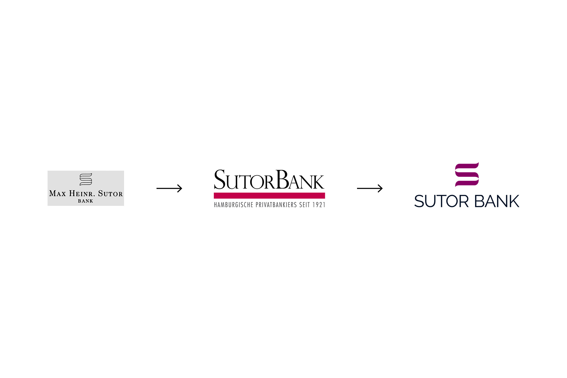
During the rebrand process, an old logo, presumably close to 100yrs old was uncovered, and it was decided to bring it back to life. The ‘S’ graphic device of yesteryear was redrawn with some refinements.

The word mark was a simple geometric sans font, but the whole logo was representative of being anchored in the past, with the same values shared by the founder, whilst projecting into the future, embracing modern technologies.

Superbank

With a couple of distinct pillars of banking, some simple brand architecture was devised, using simple lockups with the word Sutor: Privat Kontor & Platform Banking being the most prominent.

Photography was locally sourced architecture of Hamburg, where they were based, but with some image treatments to give the same tones and desaturated look across all.

Dynamic S

The ‘S’ graphic device was shown to be a recognisable symbol, creating a dynamic container to help communicate a range of different messages through strong visual language and texture.

Music foundation

Sutor Bank’s Stiftungskontor, foundation or charity service office, a strong pillar of their community with initiatives that focused around sponsoring young musical talent, especially pianists, who would ultimately be invited to perform at the Elbphilharmonie Hamburg, or Elphi, the famous concert hall in the HafenCity quarter of Hamburg, on the Grasbrook peninsula of the Elbe River. 

Legal challenge

Unfortunately, I found out years after doing this rebrand, that they were taken to court by a large state-owned German bank for proposed infringement on their identity, because of the ‘S’ graphic device, and they lost.

I have strong opinions on this, but take a look at the images and you decide.

Back