
Get In Touch
541 Melville Ave, Palo Alto, CA 94301,
ask@ohio.clbthemes.com
Ph: +1.831.705.5448
Work Inquiries
work@ohio.clbthemes.com
Ph: +1.831.306.6725

Global Relay

A global compliance tech and data management company.

Global Relay were a leader in their field, but no one knew who they were. Their brand lacked any coherence, authenticity and was not aligned with any strategy.

Task

To create a solid brand identity, built on authenticity to build brand awareness, recognition, and retention in order to build international trust and help drive growth.
  • Strategy

    Brand Strategy, Creative Direction, Design Direction

  • Design

    Brand

  • Client

    BCB Group

// Project Overview

Looking back to the future

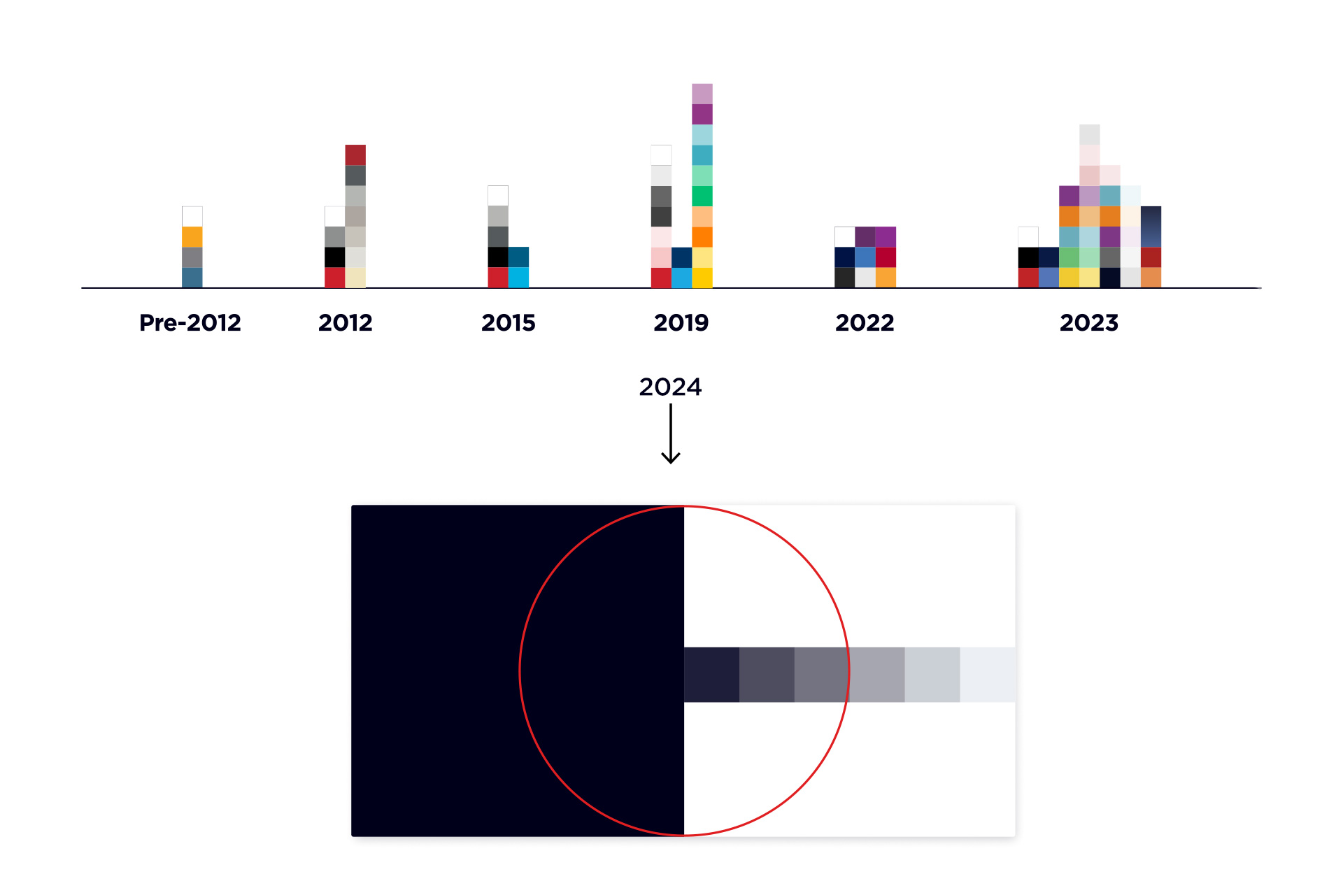
To build a brand identity that is connected to the company’s strategy, it was necessary to go back in time and look at the legacy brand. Strip back all the noise that had been collected over 23 years and distilling down to the bare essentials. This was important to create an authentic brand that was rooted in their proud heritage.

The logo was off limits, but that wasn’t the problem with the VI. Starting with the colour palette, everything was stripped back for simplicity and prestige.

An ink-black, white, and the established red being used as an accent colour.

Go Gotham

Typography was to play a pivotal part in helping to set the tone of the visual language. 

Gotham is one of the most successful typefaces of the early twenty-first century and was a perfect personification of the brand: honest, trustworthy and hard working.

Display type and kinetic typography became a big feature.

Illustrate to innovate

For such an abstract concept like data capture and management, a visual language based around illustrations was implemented. Simple works best for areas of such high complexity, and so a bespoke style was crafted to deliver something truly unique. 

Simple keylines, mostly designed on the ink black backgrounds,  but had to work on white, with the red being accent only. The illustration style evolved over time to include some glows and gradients. From more complex marketing & advertising illustrations, to simpler pictograms and simpler icons, everything had to feel connected.

Thinking made visual

The communications design was focused on clutter-free clarity, with jargon-free messaging, strong typographic hierarchy and beautifully clear graphics to support the message, making for compelling aesthetic collateral.

Moving image

02 // Challenges

The brand new
system, built from
the ground up.

With more than 16+ years of experience, our team has become a leader in digital design and innovations.

We partner with clients to translate innovative ideas into impactful digital experiences, bringing award-winning design and cutting-edge solutions to life, by helping progressive companies advance by setting.

Back